The Project
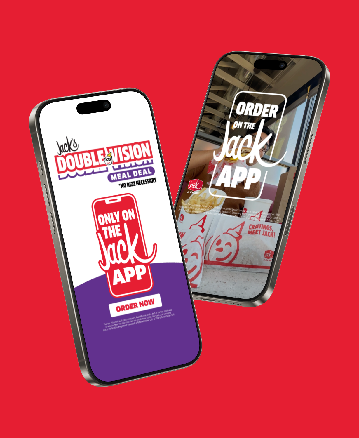
For this project, I was asked to create a toolkit that Jack in the Box could use to promote their app with a consistent and recognizable style. With the ever-increasing importance of app use in the quick-serve restaurant landscape, Jack in the Box wanted to drive customers to the app, highlight the app's functionality, and promote deals and offers available in the app. We proposed 3 unique approaches to this toolkit to show the client the range of possibilities for the toolkit.
Approach 1
The first approach stays the closest to home for the client, expanding on their existing app look and feel to create a larger ecosystem to work with. This approach is energetic, fun, and approachable, relying on bold graphic elements and playful food images.


Approach 2
The second approach pushes the brand in a modern, techy direction, showing that Jack in the Box has arrived in the digital scene.


Approach 3
Approach 3 is meant to push the client furthest from their comfort zone, treading brand new territory to really grab attention and stand out from the crowd. This approach was ultimately decided to be too elegant and modern feeling for the Jack brand, but was a valuable exploration in flexing the brand's possibilities.


The Final Product
After several rounds of exploration, testing, and collaboration with the client, we finalized a comprehensive toolkit to share with the client's in-house creative team and other agency partners.


